
Not At The Beach
Posted: July 1, 2019 Filed under: Clothes, Style Imitating Art | Tags: blue, blue scribble print blouse, navy cropped pants, pink, pink loafers, style imitating art 4 Comments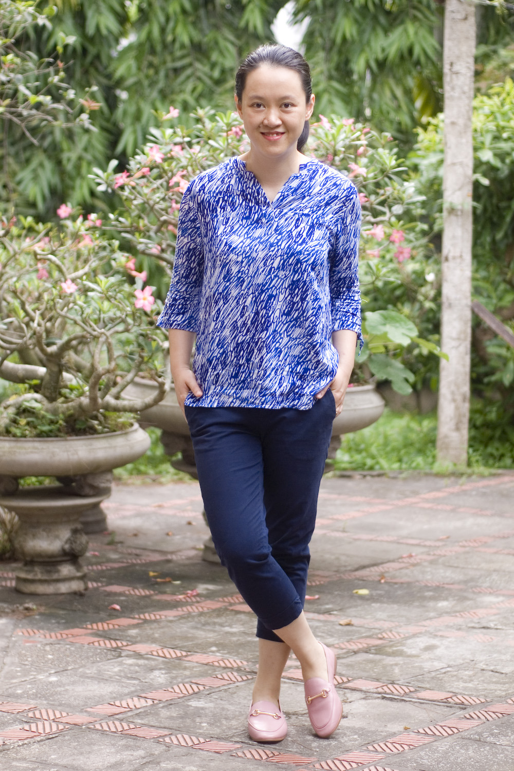
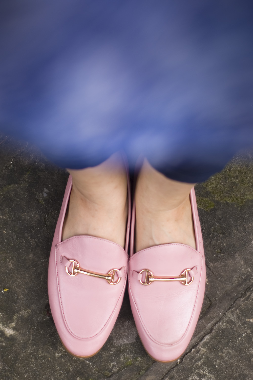
I wanted to put together something a little summery for this week’s SIA, inspired by Maurice Prendergast’s “Children at the Beach”, but I still had to go to work (so! much! paperwork!!!), so here is a work outfit instead. The print on my blouse and the blue color are to evoke the sea and the sky in the painting, naturally, and my pink loafers are to mimic the softer, daintier colors of the children’s clothes. It’s not beach-appropriate, but it’s SIA-appropriate, and I’m OK with that.


If you haven’t sent me your outfit, you still have until tomorrow! And don’t forget to drop by on Wednesday to see other outfits inspired by this lovely watercolor!


Yep, gotta look work appropriate. Your sea-inspired blue pants and top work well. I *really* like your pink loafers–I’d like a pair of mules in blush…
Great, Salazar! It may not be a “beach outfit”, but it is a summer “work outfit” and works well for SIA! I think you did great!
This was a nice painting that you chose, because just looking at it, invokes calm and relaxing feelings, which is what most watercolor paintings do for me. And who doesn’t want to be calm and relaxed during summer?
Your color choices are well coordinated with the splashes of blue and pink from the painting. Always choose function over fashion – this is a lovely work appropriate outfit.
I sent you my take on this SIA post too! My first time submitting to one of these (or any group challenge) so look for that and tell me what you think! It was an exciting attempt at trying a new style.
Ha! Work always interferes with life. That top is pretty – I really like the print.